the next project in the
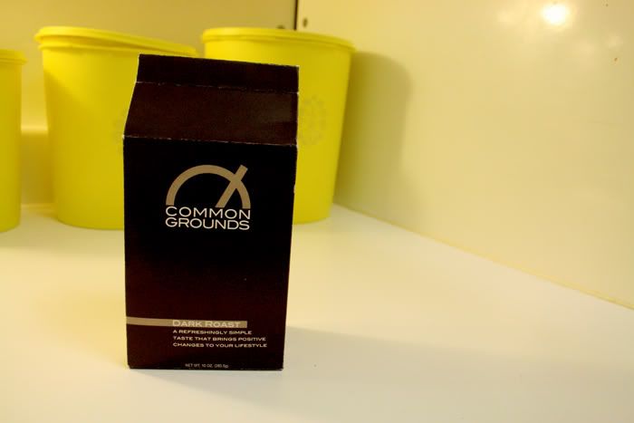
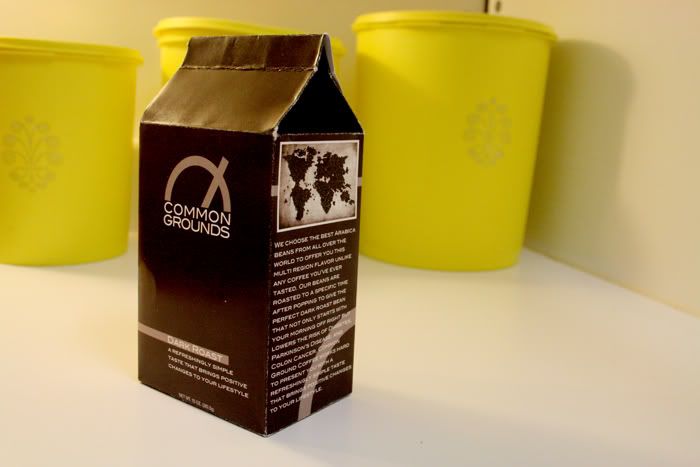
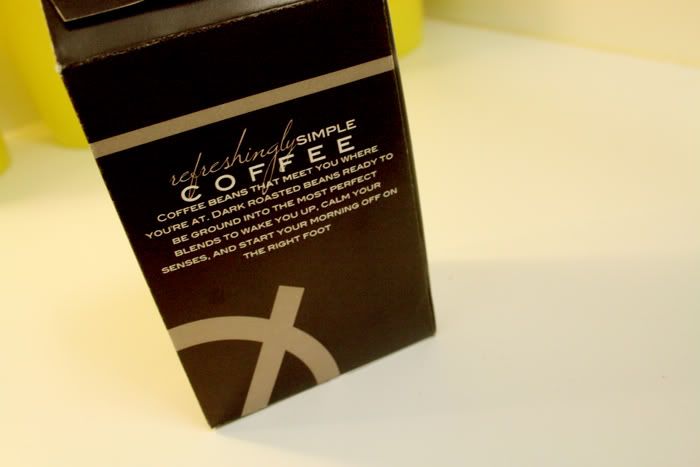
common grounds project series was to create the actual packaging for our food product. i really wanted to do something different with the coffee brand i am creating and produce a modern and unique package design thats unlike whats out there. so i decided to create coffee in a box. i created a package that is similar to the normal bags coffee is sold in but adds a little more structure and boldness to the overall presentation. my favorite part of the package is how it resembles bags of coffee but is just enough of a difference to make you want to pick it up and check it out. you'll have to forgive the white fold lines of the thick card stock, i had to do the best with the resources i had to print the mock up package. but it folded up into the real deal and actually holds the coffee beans so im pleased with the final:
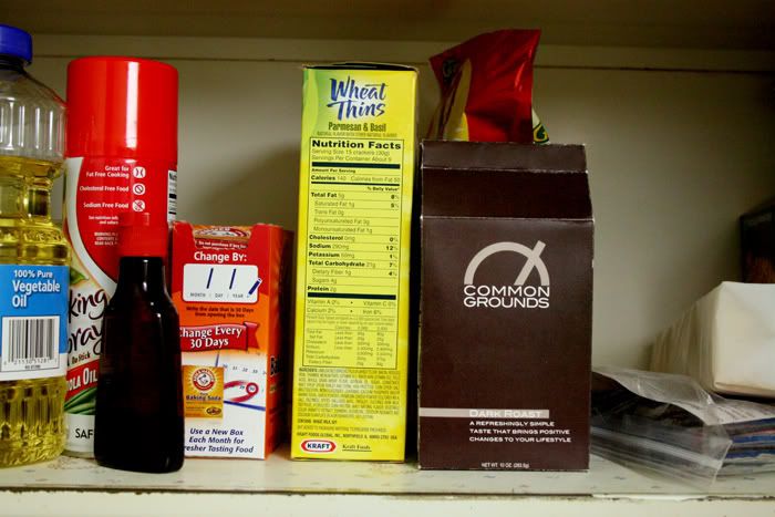
and just for kicks, i thought i'd photograph the package on the shelf with the other foods to see how it looks up there with the big guys


3 comments:
and the best thing about the box is that it will poor out easy...not like those bags that you end up losing coffee beans all over the place. :-)
wait. you're really cool. how do you even do this.... i'm impressed. and i miss you.
seriously. like... what? who knew this was even possible?
Post a Comment