Showing posts with label Design. Show all posts

Friday, May 14, 2010

kristin & zack's wedding paper suite!

quite the little treat arrived in the mail today! over the past few months ive been working with kristin & zack to create their custom wedding invitations! kristin is a good friend of my sister in chicago so when she emailed me asking if id design their wedding invitations i was so beyond excited. kristin and zack came to me with some key ideas they had in mind and i was READY to make those ideas come to life. i really love teamwork. zack had drawn the incredible tree graphic you see on the main invitation as well as the "zk" symbol located on a few of the pieces, and it became my job to translate those images to computer and work with them to create the design pieces for the big day! kristin & zack are going with a teal and grey color scheme for their wedding and i must say i love the simple and clean look of it. i absolutely LOVED working with these two to create something totally customized, totally fresh, totally them. below are some shots of the 3 front and back design pieces we created: the main invitation, rsvp postcard, and general information card!
[fronts]

[backs]

here's that tree graphic up close... the heart inside the branches, yes you guys

postcard back, love the type setting on this one

postcard front, love the consistency we're getting with the repeat of the verse and "zk" symbol

and the general information card front and back, again love the typesetting of all the information

and are you wondering what the happy couple looks like? i thought so. do these wedding invitations not just completely fit them?? LOVE IT.

oh goodness i love this stuff, i really do.

like what you see? all of the above was printed by d&l press! im telling you, its an easy process, give me a call and lets make something!

Wednesday, May 12, 2010

mirror mirror invitation!

my grandma is retiring after 35 years with the same company! she has worked for a mirror & glass company so her retirement party in june will be decorated with all sorts of mirrors and glass. i was in charge of designing some invitations for the party and this is what i came up with, using purple (her favorite color) and silver (to represent the mirrors/glass)

once again, printed by the fabulous d&l press!!

yay grandma!

Friday, April 16, 2010

a shower invitation!

my sister melissa's friend kristin is getting married this july and mel along with another friend is throwing a cute little personal shower for her and she asked me to design some simple invitations around the "tying the knot" theme. here is what we came up with!

stay tuned because i am also working with kristin & her fiance zack to design a custom wedding invitation suite for their big day! and we're almost finished!!

Monday, April 12, 2010

jaggar's birthday invitations!


here are the invitations for one year old jaggar's fun birthday party! these were printed as 5x7 front & back cards at d&l press. i think they are totally boy and totally cute!

Monday, March 29, 2010

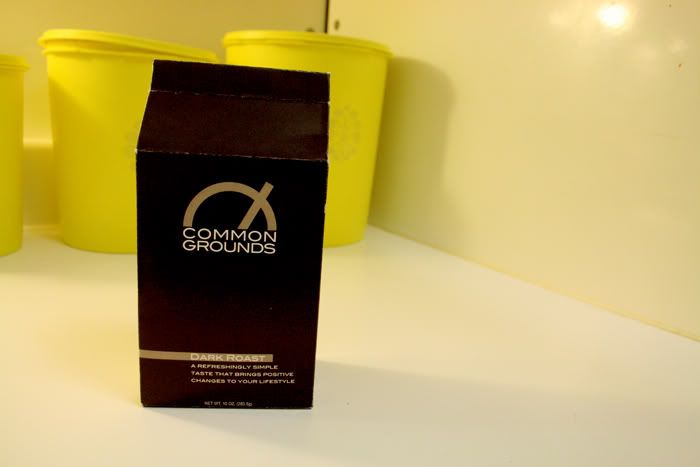
common grounds, the package!

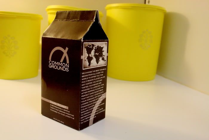
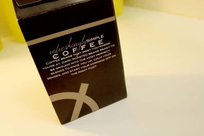
the next project in the common grounds project series was to create the actual packaging for our food product. i really wanted to do something different with the coffee brand i am creating and produce a modern and unique package design thats unlike whats out there. so i decided to create coffee in a box. i created a package that is similar to the normal bags coffee is sold in but adds a little more structure and boldness to the overall presentation. my favorite part of the package is how it resembles bags of coffee but is just enough of a difference to make you want to pick it up and check it out. you'll have to forgive the white fold lines of the thick card stock, i had to do the best with the resources i had to print the mock up package. but it folded up into the real deal and actually holds the coffee beans so im pleased with the final:


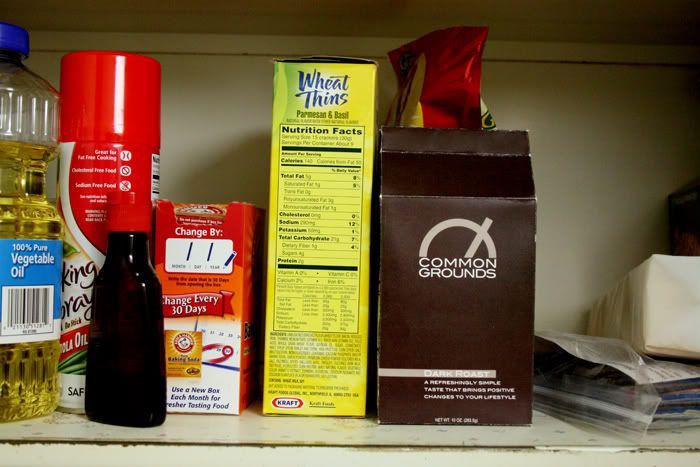
and just for kicks, i thought i'd photograph the package on the shelf with the other foods to see how it looks up there with the big guys

Thursday, March 11, 2010

calendar!

i just finished my most favorite project yet.

we had to create some type of 3D calendar incorporating any lyrics or poem on each of the months that give the calendar an overall theme. one of the biggest no-no's of this project was for the calendar to simply be a spiral bound hanging calendar. so we had to get creative, a new and unique way to display a calendar.

 i.was.pumped.

i decided to create a wooden base with thick board sliding panels that change in and out for each month. for the lyric/poem part i used various verses from the bible that correspond with each season. definitely take the time to read each of the verses, they are so refreshing. the back of the panels has space for writing notes and birthday/special day reminders.

oh and we only had to create 4 months plus some sort of cover so that is what is shown here, but i will be completing the other months and busting this baby out once 2011 rolls around


i chose to use these faded symbols behind each month calendar to reinforce the theme for each month

one of the reasons why i loved this project so much was because it forced me to really explore my ideas and limits as a designer. i had SO much fun creating the wood base from scratch pieces of plywood. working with materials other than just paper opened up a whole new door for me and i definitely found a new love and passion for piecing together 3D materials with my designs. this is something i hope to continue to explore.

ive been thinking about this quote lately:
"Design is in everything we make, but it’s also between those things. It’s a mix of craft, science, storytelling, propaganda, and philosophy."
and i think this project pretty much sums it up. design is so much more than what comes out printed on that paper. its conceptual. and this project gave me the chance to show that.

Tuesday, March 2, 2010

cards!

lately ive been in the process of creating a consistent identity i'd like to brand myself with. this is a long and hard process when working for someone else but when you yourself are the client, the job becomes that much harder. one thing ive wanted for a while now is little cards to pass out to people who request information on photography or design, a business card if you will. and for valentines day that cute guy joel paid for me to have professional business cards printed!! like seriously? most girls get flowers and chocolate for valentines day, but me? i get business cards. i love that. love that he thought of it. (i must say i was also given a beautiful necklace along with these cards. he's way too good to me) so i began the task of designing my very first business cards and after changing my mind about 235 times, i am pleased to present you with them!

the front.

the back. why yes, that does say www.stephbarber.com right there, CHECK IT OUT! thats my next project ; )

and just because it makes me so happy to see them neatly stacked like this...

these were fabulously printed by my favorite printers ever, d&l press. 

and there's plenty more where this came from... im working on using my new brand identity on a new blogsite that will be up and running soon!! i'll sadly be saying goodbye to the blogspot world and moving on to bigger (and dare i say better) blogging! for now, just for kicks, check out www.stephbarber.com and just get excited about that fact that i have a real .com site.

for now,
sb.

Wednesday, February 24, 2010

a save the date postcard!

for mike & katie!!

the front:

the back:

love it when photography turns into design. LOVE IT.

Tuesday, February 16, 2010

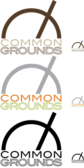
introducing common grounds

this semester in my graphic design class we had to choose a food product that we'd be working with throughout the rest of the semester. we will be creating a visual identity for the product that will be incorporated in the actual packaging, a multi page print ad, and a website. the first project was to create the food product and the logo, using 2 different color schemes and a b/w version. we also had to display a scaled down (20%) logo to show what it will look like smaller.

i chose to create "common grounds" coffee... where good conversation meets good coffee. mmmm....

common grounds is all about a refreshingly simple taste that brings positive changes to your lifestyle.

our next project is the packaging, which im stoked for. its gonna be something you've never seen before. cant wait.

Monday, January 25, 2010

a wedding reception

cindy & john got married!

their good friends are throwing a reception in their honor and asked if i'd design the invitations. the gathering is on valentines day so we decided to go with that for the theme. aren't cindy & john a beautiful couple? from what i hear they had a lovely, intimate, and simple wedding ceremony in the home of their friends.

d&l press came through again with a fabulous print job on these!

Saturday, January 23, 2010

dont forget about design!

one thing i'd like to focus on in the 2010 year is more custom graphic design for clients. both photography and design are HUGE passions of mine and i have been so blessed to have opportunities to do both and even work with clients who allow me to integrate the two. i love nothing more than going from behind the lens to in front of the computer with my photography and design to offer something unique and totally customizable for my clients. i am learning and growing so much within the visual communications program at nau that i decided its time to start offering more design services. for a while now, custom designs have been something that clients and people have just randomly approached me about after hearing im in school to be a graphic designer. it hasn't been anything ive really pursued. so in the new year, im making it my goal to change that. i want to put my designs out there. in an effort to do so, ive been working hard creating a sample design package that includes some random designs for various occasions. this is just a plethora (yes, i just said plethora) of invitations, announcements, save the dates, stationary, etc. that ive developed to show you what i can do. i hope you see something you like and email me at stephbdesign@aol.com to talk more with me about what we can make together!

this first piece is a sample bridal shower invitation. the more i look at it, i think it could also function well as a baby shower invitation. so we'll say it counts as both : )

i made up a fake couple, "amanda & david??" to create some wedding pieces for. the following are two sample invitations for their big day. the second is a bit more formal than the first.


and now for some save the dates! i decided to use an image from anneliese & marc's e-session last year for this first sample. this save the date is an example of using the image itself as the background:

i decided to create 2 sample wedding suites. each includes a save the date card, the formal wedding invitation, an RSVP card, and a program for the ceremony. suites may also include table numbers, table assignment cards, reception invitations, dinner menus, etc.

for this first suite, i also decided to use anneliese & marc as the couple. the first part of their engagement session had such a modern feel to it so i decided to create a modern suite for brides & grooms choosing to shake things up a bit with their printed wedding materials. here is the wedding invitation:

RSVP card:

ceremony program:

and a save the date:

and for the more traditional couple, i came up with a sample suite that includes simple but formal touches. oh, and for this i just used our fake "amanda & david" couple. formal invite:

RSVP:

program:

save the date:

so now that "amanda and david" are married, a few years have past and they're having a baby! and here is a fake invite for that fake baby shower:

and now its jack's birthday! ya know, amanda & david's baby boy. obviously jack is turning 8 but this invitation can be done with any age number.

i hope that one of these sparked something in you like "hey, i need something like that." because i would absolutely LOVE to hear from you and work together to create exactly what you want. design pricing for 2010 is in the works and i hope to have it posted shortly. but in the mean time, shoot me an email and we can talk about how this process typically works.

and hey, tell your friends! looking forward to hearing from you.... and your friends : )

Tuesday, January 19, 2010

rooted logo


i was asked to create a logo for our new semester theme at nau intervarsity. the theme is "rooted" and throughout the semester we will be looking at various parables where Jesus calls us as followers to be deeply rooted in things such as prayer, scripture, devotion, etc. in order to ensure growth in our lives. the logo i came up with is my interpretation of what that should look like, with the cross as the central element stemming up from the roots. im excited for this semester and the plans God has for our chapter and campus on a local and international level.

Saturday, December 26, 2009

christmas cards!

i absolutely LOVE christmas cards. each year i look forward to getting cards, pictures, & letters from good friends and family seeing what they're up to and how everyone has grown and changed. and obviously i look forward to seeing the designs and photos that everyone chooses. so naturally each year i cant wait to design some myself!

if you remember this time last year i went all out promoting custom christmas cards i'd be designing. since this year, and specifically these past few months, have been a bit crazy for me i decided to keep it simple and hold off on the special christmas card promotion. but a few fine folks did contact me to design their cards this year and im very grateful to have had the opportunity to work with them!

here's the wonderful H family, using a photo from their photo session in october

next is chris, jordan, & jaggar. that cute little family from november's photo session

and here is lindsay & colin. lindsay's sister bethany went to school with me last year and lindsay is a good friend of joels sister. i was pumped when she emailed me asking if i'd design their christmas card! i hope to work with these two again with photos or other design needs ; )

i know you all remember this sweet face. who could forget this guy from their family photo session a week or so ago. his parents andrew & janae run D&L Press and actually printed the majority of the cards you see here. they made it super easy for me : ) i got to see them all printed out and they looked fabulous!

ok this one wins for most hilarious card. gotta love ben. he contacted me sometime back in march during "march mustache madness" and asked if i could get together for a mini photo session. the month was coming to end which mean, unfortunately, the mustache would be gone and he wanted to document it for a christmas card he'd be sending out later in the year. he threw out some ideas like sitting in front of a fireplace with a christmas sweater on saying "stay classy" with his eyes. after the shoot (in MARCH) i let the images sit on my computer for a while until earlier this month when we began designing the card. ben had a vision... a cheesy, 70's, retro, hideous, classy vision. after it was all finished i told ben "it was actually difficult to design something this gross." and im sure ben took it as a compliment.
and this is my own family's card. we decided to keep it simple and minimal this year, utilizing some photos from our thanksgiving in prescott.

so those are the cards for this year! i had even more fun putting them all together than last year and i already have a few ideas for christmas cards 2010... its gonna be the biggest and best year! oh and keep an eye out for one last card thats going over for new years that i have yet to post : )