
anyways, back to type class. our first assignment was the letter cube. we had to come up with 5 adjectives that described ourselves to be illustrated on each side of the cube. easy, right? false. the catch is, you could only illustrate these adjectives with your (2 or 3 letter) initials. but wait, there is more. so now you are using your initials to illustrate the adjective but you must ALSO incorporate one of the 5 design elements (rhythm, unity, positive/negative space, emphasis, & scale) on each of the panels. think thats it? think again. because this is a TYPEography class, we were required to pick and chose from a list of (boring) typefaces that also needed to be chosen based on how they fit into our adjectives/design principles. that is 3, count em 1-2-3, elements you must represent on each side of the cube!!! ----------> kill me now.
i chose my adjectives before knowing what the assignment was and quickly changed them after i found out how difficult this project was going to be. its already awkward and weird enough picking adjectives to describe yourself. i was happy with my neutral, non-conceited words. however, i decided i definitely needed to simplify my adjectives if i wanted to live to see my 20th birthday. the adjectives i chose were tall, outgoing, energetic, creative, and relatable. ha, pretty easy to illustrate with my initials yeah?! again, false. it took me forever to find out how to use my plain old SB letters to somehow represent these adjectives LET ALONE incorporate one of the design principles to each one.
SOMEHOW i managed to get this project done, on time. after 50 thumbnails, 2o roughs, and 2 comps i am pleased to present to you: the cube that says it all:
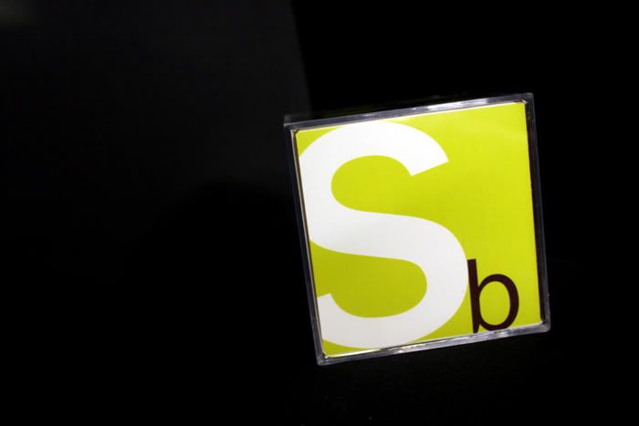
this first side is supposed to represent the adjective relatable and the design principle of emphasis. this is probably my favorite side.

next we have the adjective outgoing along with the design principle of positive/negative space.

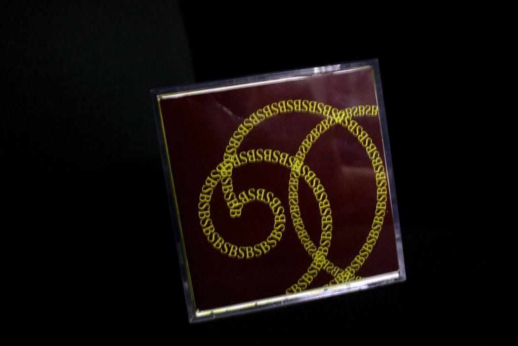
this side is the adjective energetic with the principle of rhythm. this is a close tie for my favorite side.
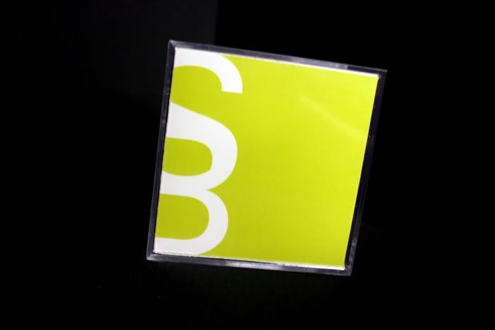
pretty obvious.... it means tall. showing the design principle of scale.
this side is for creative and uses the design principle of unity.

on the 6th side we had to include our name, adjectives, and typefaces we chose to use.

so there it is. the small object that has consumed most of my life the past 3 weeks. worth it? ehhh, im gonna go with a NO. so much for being prematurely in love with this type class. but ya know what? its over, turned in, and i bet i got a decent grade so i guess i should walk away a little bit happier.
(plus im going to wrap this at christmas time and white elephant gift exchange it. SCORE! hey, it'd probably make a sweet paperweight.)
speaking of christmas... who's excited?! gosh im already ready for it. bring it on santa.


2 comments:
so i can totally understanding your frustration, but give yourself some credit! you are so creative and i would NEVER have been able to do something like that! you amaze me :)
Steph,
This is amazing. Way to knock it out of the park! I have to admit my favorite is the energetic or wait, maybe it is creative. Oh, I don't know I like them all.
Post a Comment